
Here are the 6 logo design principles that make all the difference.
The 6 Principles of Logo Design
Have you ever wondered why some logos stand out? Why some designs stick in your brain and others fade away when you look away? There are some very good reasons why this happens.
Designing a logo doesn’t just require an artistic eye, there’s science to it too. There are some fundamental principles of logo design which any designer worth their salt is going to follow religiously. In no particular order, here they are.
 1. Unique.
This one should be pretty obvious. A logo is a company’s way of identifying their goods and services and differentiating themselves from other similar businesses. You need a logo that tells potential and existing customers that your goods and/or services are exceptional; so you need to stand out, not look generic. You want people to remember you.
 2. Simple.
Believe it or not, this is arguably the most important aspect of logo design. Gradients and drop shadows, multiple colours and outlines, those are usually the sign of an amateur designer. Don’t believe me? Go look at some of the most successful big brands’ logos out there. You will discover that each one is highly individual as well as clean and simple.
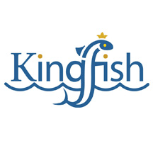 3. Memorable.
An effective logo should be highly memorable of course. This is achieved by simplicity (see previous point) as well as by using some kind of visual effect or device to create a lasting impression in the viewer. Often this is a visual double entendre (such as the letter “f” being the fish in the example to the left), or it can simply be the beauty and harmony of the design.
 4. Timeless.
When designing a logo, one wants to produce something that will endure. Trends come and go, but a great logo will stand the test of time. Some big brands’ logos haven’t changed in decades. An effective logo uses good design fundamentals and steers clear of the current flavour of the month. It’s okay to update to stay fresh, but your original design should hold true.
 5. Versatile.
An effective logo should work across a variety of mediums and applications. The logo should be functional, which means it should be designed in vector format so that it can be scaled to any size. It should also be able to work in horizontal, vertical, and square formats. Most designers start off in black and white to get the visual harmony just right before proceeding to full colour.
 6. Suitable.
A good logo should be suitable for its brand. For example, if you’re branding a company that produces hydro electric controls, it would be appropriate to use electricity symbolism. This would not be suitable for a children’s clothing store. It doesn’t necessarily have to show the product or service of the business — this can be conveyed through other means.
Whether you’re a designer yourself or someone interested in the ins and outs of design, I hope you’ll look at logo design a bit differently after reading this. There is a lot of strategic thinking and hard work behind logo design.
Do you need a logo for your own business? Let’s get in touch! I’d love to talk about how we can work together to make your company look better and win more business.

Pingback: Business Cards, Brochures, Outdoor Signage – All The Graphic Design! | Sumack Loft
Pingback: The Logo Design Process with an Ottawa Area Graphic Designer | Sumack Loft
Pingback: How Do Logos Get Made? | Sumack Loft
Pingback: Logo Design Is Not About Personal Taste | Sumack Loft