How do logos get made?
Don’t worry, this story is suitable for all ages. 😏
I think of February as hump month. For us Ontarians, it’s really the middle of winter. And if you’re in Ontario, you might like to know that there are only 36 days left until spring. That’s a good thing after the winter we’re having! With these thoughts of spring, I decided that I would put together a wee story for you about how a logo grows from a little seed of an idea into a full fledged design.
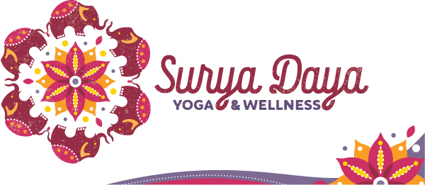
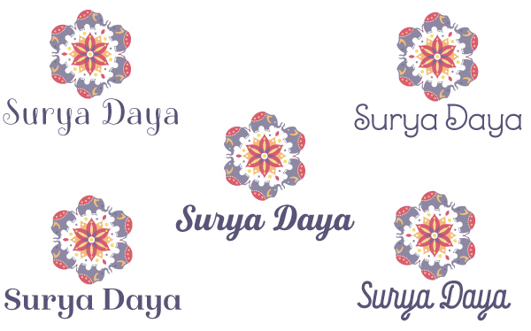
![]() If you follow my website, you’ll know that we recently completed a total rebrand for a small yoga studio in Almonte, Ontario, now called Surya Daya Yoga & Wellness. And if you follow my blog, you may have seen my posts about the process of logo design and the importance of adhering to good logo design principles.
If you follow my website, you’ll know that we recently completed a total rebrand for a small yoga studio in Almonte, Ontario, now called Surya Daya Yoga & Wellness. And if you follow my blog, you may have seen my posts about the process of logo design and the importance of adhering to good logo design principles.
The owner of Surya Daya approached me and we had a lovely long chat about her exciting new business venture — Amber had taken over the studio just a few months prior and realized she needed to make it her own.
Once Amber had settled on a new name for her business and we had identified a suitable budget, she provided me with a detailed creative brief, and the process of creating her new brand began. First up is always putting together inspiration boards, and for this I use Pinterest as well as LogoLounge. Amber was very clear that she wished to have an elephant represented in the design and also hoped to include a sun mandala in some way.

The Surya Daya Pinterest inspiration board
As soon as I feel good and inspired, that’s when the fun part begins and I get out my paper and pencil. Paying meticulous attention to the direction my client supplied in her creative brief, I sketched out somewhere between 10-15 quick ideas, and then chose 4 to develop that were very strong contenders to represent Amber’s core mission and values.
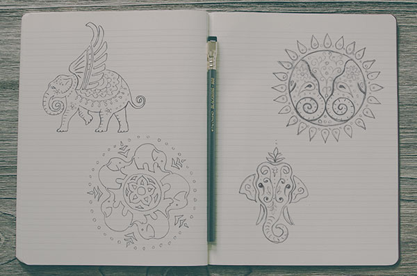
Logo Development Sketches
These concepts are supplied in a presentation document with a careful explanation for each to help my client decide which one is the best fit. Amber enthusiastically chose the rings of elephants around the mandala, and the digitizing process had begun!
 I wanted the ring of elephants to have a certain geometry, so I started by creating one elephant and paid attention to producing a structure created by circles — see sketch. By using a limited number of circle sizes and ensuring all forms in the design follow those circles, an engaging harmony is lent to the whole.
 Once I had the elephant designed to my satisfaction, the next task was to ensure that all the elephants work together in a ring, and to create the sun mandala by carefully creating more circles and overlapping them and dividing them where it made sense.
One of the more comedic moments was my esteemed spouse pointing out that the design might work better if the elephants were facing each other rather than having their noses up each other’s tails!
 Now that I had the elephants where I liked them, and the sun mandala getting into shape, it was time to start playing with colour and touching up the finer details of the design.
The mandala was still too flower-like so I added some rays and inner/outer elements to the design — still flowery but also more sun-like. The elephants needed a bit of texture so the blankets were embellished somewhat, and toes got added to those feets!
One of the most challenging parts of logo design is choosing the right typeface to represent the business. Like any designer worth her salt, I have a vast collection and there are just so many choices! You can see a smattering of options that were tried below, along with more colour exploration.
Surya Daya Typeface Exploration
Once I had the typography figured out for the brand and had presented the final design to Amber, she really felt strongly that her identity needed to be warmer, with the primary hues more in the red spectrum; so with a little trial and error, we came up with the finished palette, which you can see below. Dark reds with cranberry overtones, a sprinkling of ambers and yellows, and a dash of purple.
Amber is completely thrilled with her new graphic identity, and her new website which naturally was also designed by Sumack Loft. She is delighted by the feedback she is receiving from her clientele, many of whom have been involved with the studio since its inception 12 years ago, under its old name.
Do you feel a bit better informed about the process of designing a logo? Maybe you even want to work with me! Let’s get in touch! I’d love to talk about how we can work together to make your company look better and win more business.