Happy New Year!
A few days late, but whatevs! So, just for fun, I took some time on New Year’s Day to look back over the wide variety of interesting jobs I was able to work on this past year. I designed 26 logos in 2016. Whaaat? That’s a logo every two weeks. Cah-razy! Some had big budgets for elaborate development, while others were simple solutions easy on the pocketbook. Just for fun, I thought I would give you all a brief overview of some of those logos, chosen for the variety of business offerings and design diversity.
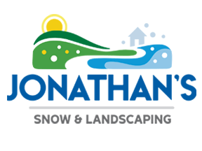 Jonathan’s Snow & Land
Last winter I was fortunate enough to work with Jonathan and Tori of Carleton Place, Ontario. They were looking for a logo that was big and bold yet would appeal to an older crowd. Together we conceived a charming and homey logo that feels trustworthy and reliable yet fun.
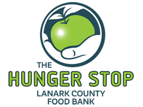 The Hunger Stop
I was approached by the Lanark County Food Bank first thing in 2016 for help developing both a new name to brand their service and an accompanying logo. We created a visual identity that conveys the notion of both giving and receiving, with a polished yet organic design.
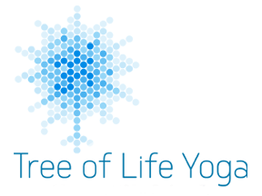 Tree of Life Yoga
Early in the year I was asked to design a logo for a small private yoga practice. My client requested a design that communicates the idea of light, strength, mobility, and rootedness, based on the Christian Tree of Life. We worked together to develop this design full of light and motion.
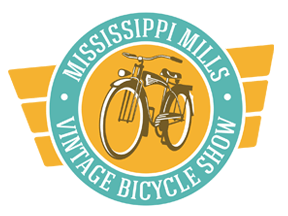 Vintage Bicycle Show
Jeff Mills at Mills Community Support and I had loads of fun developing a logo for the inaugural Mississippi Mills Vintage Bicycle Show. With its antique colour palette and illustration of a gorgeous old bicycle, the logo projects a fun and lively image combined with a sense of history and tradition.
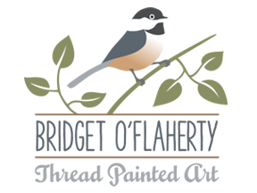 Thread Painted Art
Bridget O’Flaherty is an established local fabric artist who creates gorgeous “thread painted” artwork. We are exchanging brand and web design in return for a handmade quilt. Her new graphic identity is artistic, elegant, organic, and professional; with a new e-commerce website coming soon.
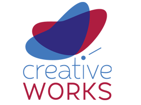 Creative Works Upcycling
An enthusiastic entrepreneur with a small budget and a big heart needed a logo last summer to showcase her small business of upcycling furniture and décor. A butterfly was selected to represent metamorphosis and developed into a design that is organic and friendly, much like her product.
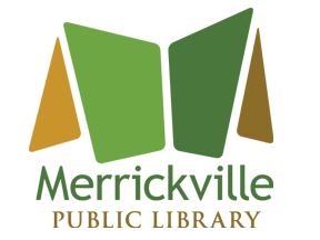 Merrickville Public Library
My web partners were approached by the Merrickville Public Library last year for a new visual identity and website. We all took great enjoyment in designing this logo which doubles as an open book as well as the roof of the beautiful old heritage building that houses the library itself.
 Nebbs Transport
A family business of many years, the folks at Nebbs came to me late in the year recognizing it was time for a legitimate logo. We developed a map graphic showing their service reach with a charming crinkled effect to recollect all those years of folded maps in the glove box.
So many logos, so little time.
These eight logos are just a sampling of the many visual identities produced out here at Sumack Loft last year. It was so hard to only pick eight! Do you have a favourite? Leave me a comment and let me know. I’d be very interested to know your thoughts.
Does your business need a new logo? Does it need a little brand refresh to keep it up to date? Give me a call! I’d love to chat.

Great tips! This is very informative. I’m learning graphic design. It helps me visualize the logo that needs to be designed to fit the times. Thanks
LikeLike
Pingback: A Year in Review for an Ottawa Graphic Designer | Sumack Loft
Pingback: The Logo Design Process with an Ottawa Area Graphic Designer | Sumack Loft
Pingback: A Year in the Life of an Ottawa Logo and Brand Design Specialist | Sumack Loft