
Sometimes a logo tags along with website development.
 My awesome web development partners were approached by the lovely folks at the Merrickville Public Library a few months ago to put together a proposal for a new website since their old one was sadly out of date. You know how it is, everything is tiny and busy and of course not even remotely mobile-friendly.
We recently completed a new online presence for both the North Grenville Public Library, Merrickville’s closest neighbour, and the Mississippi Mills Public Library, and since all those library people know each other and are familiar with each other’s websites, the staff in Merrickville really appreciated what we’d been able to accomplish for their colleagues.
During the initial exploration period, my partner Dagne Forrest at Foil Media realized that the library didn’t have a proper logo, so she added that development work to our proposal and gave the library folks a gentle steer. Because we were able to offer a very reasonable cost range for the logo design, the client was intrigued and agreed to the extra spend.
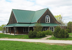
The appealing steep tin roof with its charismatic angles forms the shape of an open book, while any library member will of course recognize their library building hidden in the logo!
![]()
Once Dagne had established that WordPress was the most appropriate solution for the library’s new site, she proceeded to delve deep into the needs and requirements for the new library website, identifying what kind of content they would have and how that should best be presented, along with what kind of functionality was needed, and determined that the Outspoken theme (a WordPress template) would ably answer to all those needs. Dagne then set about developing a site architecture to display all that content and functionality in the most accessible and clear way possible.
Meanwhile, out here at the Loft, I was working closely with the head librarian to get the logo design down pat. We decided upon a design based on the charming heritage building which houses the library (see photo above). The appealing steep tin roof with its charismatic angles forms the shape of an open book, while any library member will of course recognize their library building hidden in the logo. Once Dagne had the library’s website structure established, graphics based on the new brand were developed and voilà!
The Merrickville Public Library has a highly practical new website and a visually compelling new identity.
We’d love to help you develop your new brand and website. Give me a call today to discuss!
